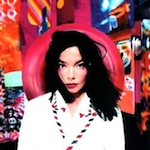
Having only just arrived in London when she recorded her first solo album, it was only by the time of ’Post’ that Björk was starting to get a feel for the place. "I look on ’Debut’ and ’Post’ as my London records,” she explains, "before and after." Hence the latter cover’s attempt to capture the growing confidence, yet continued surprise of what she herself calls, "The country girl who went to the big city."
On the cover Björk is surrounded by a swirling background of bold, bright colours which, on closer inspection, are revealed as a collection of giant postcards. Although she is the centre of attention, she struggles not to be overwhelmed by her sense of awe. "It’s so outrageously gorgeous," she explains, "it’s on the edge of being too much. It’s like the kid in the candy store just before OD’ing. I worked with a lot of people on ’Post’ so it was a question of being introduced to a new town and tasting a lot of sweets."
Not everyone was so new. Paul White, founder of design business Me Company, which evolved out of Björk’s record label One Little Indian, has designed every Björk sleeve so far. "l’ve known her for 12 years," he explains, "from when The Sugarcubes released ’Birthday’ in Iceland and it was sponsored by a sugar-cube company. They were looking at ways of putting it out over here, and they were mates of mates."
The pair’s creative synchrony was crucial in developing ’Post"s distinctive look. "Because we’ve known each other since we were teenagers, Paul knows me inside out," explains Björk. "He takes the piss by saying that he has a special Björk box in his brain which he can just take things out of,"
Originally intended to feature Björk surrounded by her favourite possessions, the image soon evolved into Björk backed with giant postcards based on her choice of items. She chose to wear an airmail-inspired jacket, coincidentally created for a postal-themed show by fashion designer Hussein Chalayan.
At the insistence of photographer Stéphane Sednaoui, the shoot had to be outside. "I think it was a Sunday morning," says White, whose Me Company team recreated a studio, complete with wind machine, in a back street near the Bank Of England in London.
"There were about 50 cards," Björk recalls. "We had them on a string in the street and they swirled around like a mobile. It’s a funny word, mobile, the Icelandic word for one translates as ’restlessness’, so there was a lot of restlessness in there, which is a good word to capture the feeling of the album. The rural girl has gone to the big town and she’s definitely restless."
The back sleeve, a computer-generated picture of water lilies, was also integral to the overall impression. "With all our sleeves theback relates to the front," White explains. "It’s a thoroughly modern image and a reaction to the sense of awe on the front."
Björk understands the importance of imagery. "Personally, if I could pick, I would do music only, but most people are trained more with their eyes than their ears," she explains. "It might take them ten listens to get an album, but with the right cover they will get it in the first one." The ’Post’ cover, she believes, is a useful aid. "It had a finger on the pulse of where I was at that moment. We managed to document the restlessness and enthusiasm and my love affair with London."
The Björk Ethic
Why Björk has appeared in a variety of guises on her album covers.
"I don’t think of it as Björk on the sleeves," White explains. "They are different characters at different times." From the simple young girl of ’Debut’ to the elaborate Geisha on the Nick Knight-photographed ’Homogenic’, the image is dedicated by each record’s flavour. "You write all the songs in a particular emotional location, then when you start doing the cover, you’ve moved. When I write the songs I’m in the middle of it all and if you asked me what they’re about I couldn’t tell you. A year later I look back and see," Björk explains, although she says she doesn’t write in character. Giving each a nickname and treating them like they’re another person, the sleeve’s characters are, according to Björk, a useful way of drawing a line under each project. It’s quite a healthy way to tie a ribbon on that period and kiss it goodbye."


